Salifact

Category
SaaS
The Challenge
Four goals shaped every decision: making the value proposition legible within 8 seconds so the hero copy was rewritten until it was — never the layout adjusted; elevating integrations to a homepage section and top-level navigation item because 75% of buyers evaluated them before anything else; building all content into Framer CMS from day one so marketing could publish, update, and revise without a single engineering ticket; and designing a component system capable of supporting new feature pages, expanded integrations, localisation, and A/B testing as Salifact scaled — without structural rework at each milestone.

The Solution
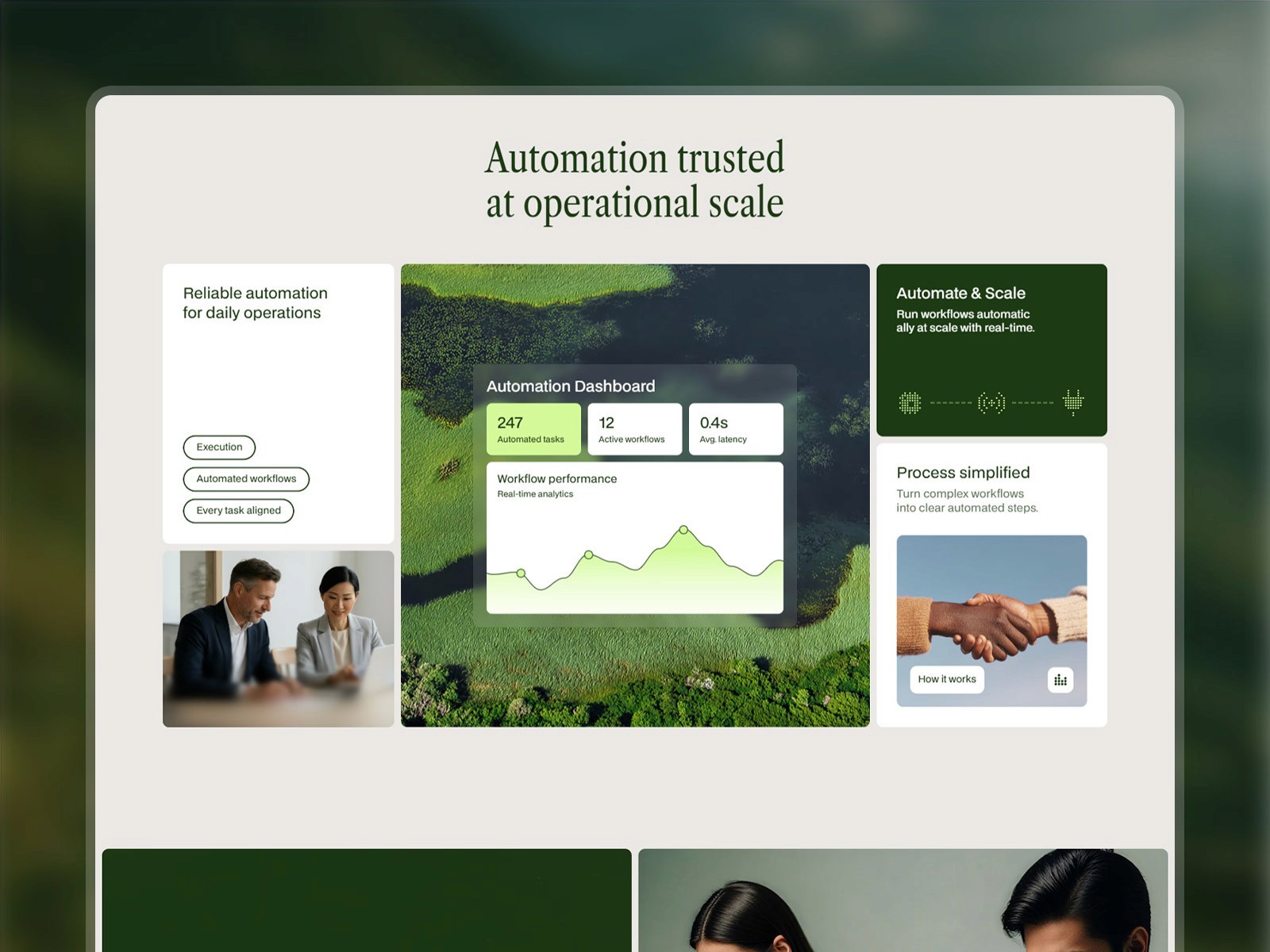
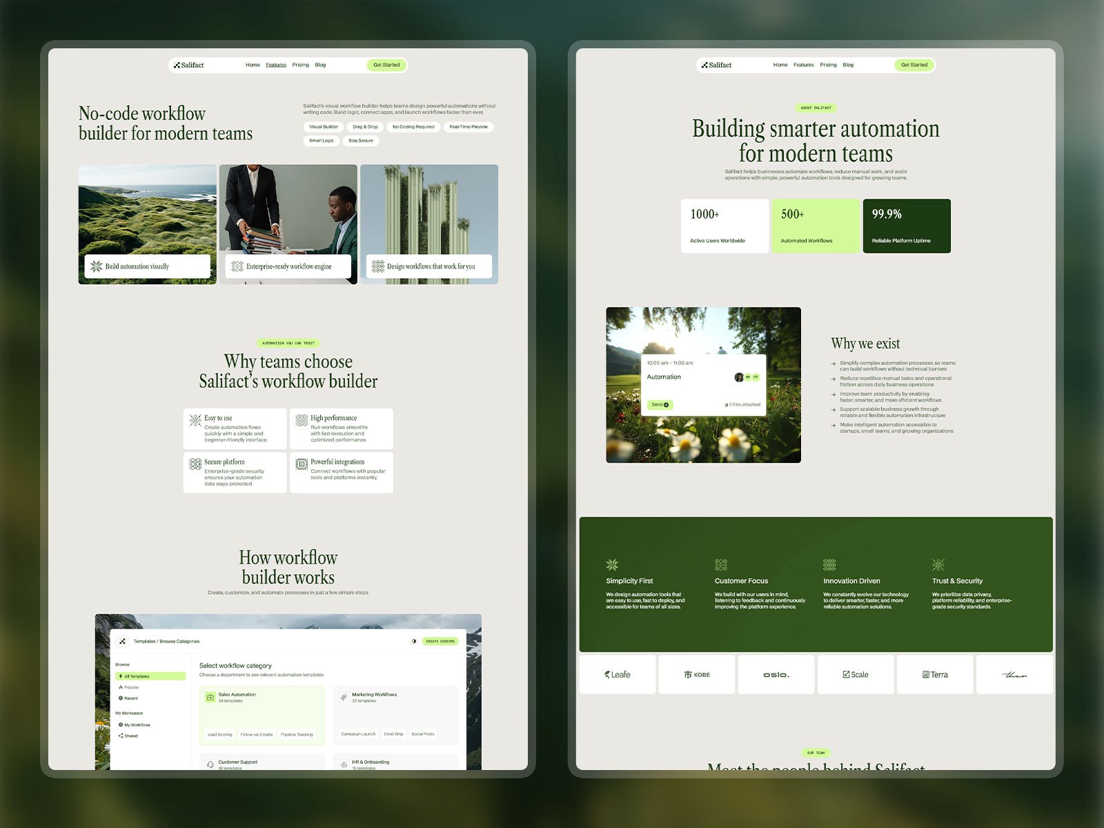
Design began with the system — colour scale, type system, spacing tokens, and component library — before a single page layout was sketched, so that every decision downstream had a coherent foundation and any token could be updated globally through Framer's variable system without touching individual components. The visual direction followed a single principle: automation software runs in the background of a business, and the product should feel like it too — calm, structured, and quietly confident rather than loud or excitable. That conviction ran through every choice, from the green palette and the weight distribution in the typography to the generous white space between sections and the decision to show a real dashboard in the hero rather than a marketing illustration.
Gallery

The Outcome
Three weeks of research saved significantly more than three weeks in rework — every revision during prototyping was rooted in a specific finding, which made changes fast and defensible rather than slow and contested. Building the CMS schema before designing dynamic pages prevented the costly retrofit most Framer projects encounter, because any content type that will change post-launch belongs in the CMS from the first design conversation, not added once static pages are already built. Salifact's visual distinctiveness comes from what it does not do: one typeface family, one hue, a strict spacing scale, with the consistent temptation to introduce variety resisted at every decision point — restraint is what makes the outcome feel considered rather than assembled. Starting every layout at 375px forced content prioritisation at the design stage rather than the build stage, turning the mobile constraint into a content editing tool that produced a cleaner desktop design as a consequence. And launching core pages before paid acquisition began created a window to find and fix conversion problems before budget was committed — a phased sequence that saved a material amount of wasted spend in the first campaign cycle.
Project price
Tools used
Framer, Notion, Lottie